Color is so cool. As a designer, how you use color directs the use of a product. Color choices define your personal style, just look at the vibrant hues of Paul Rand. Here are a few techniques I use when picking colors.
HSB for days
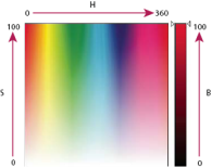
I always use a tried and true method for picking colors. I heavily employ the HSB (Hue, Saturation, Brightness) color model to create color schemes. Here is a description from the Illustrator Help docs.
Hue - Color reflected from or transmitted through an object. It is measured as a location on the standard color wheel, expressed as a degree between 0° and 360°. In common use, hue is identified by the name of the color, such as red, orange, or green.
Saturation - Strength or purity of the color (sometimes called chroma). Saturation represents the amount of gray in proportion to the hue, measured as a percentage from 0% (gray) to 100% (fully saturated). On the standard color wheel, saturation increases from the center to the edge.
Brightness - Relative lightness or darkness of the color, usually measured as a percentage from 0% (black) to 100% (white).
When using this model, I lock in the Saturation and Brightness value. Then I play around with the Hue value to find colors that complement each other well. From there, I may create more colors by adjusting Brightness to provide darker or lighter variants for more primary colors, accents, and alternative states (hover, focus, etc).
I make color schemes in Illustrator with the Color Picker.
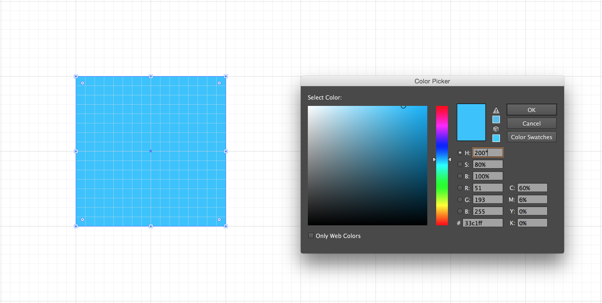
We start out with this blue. HSB(200,80,100)
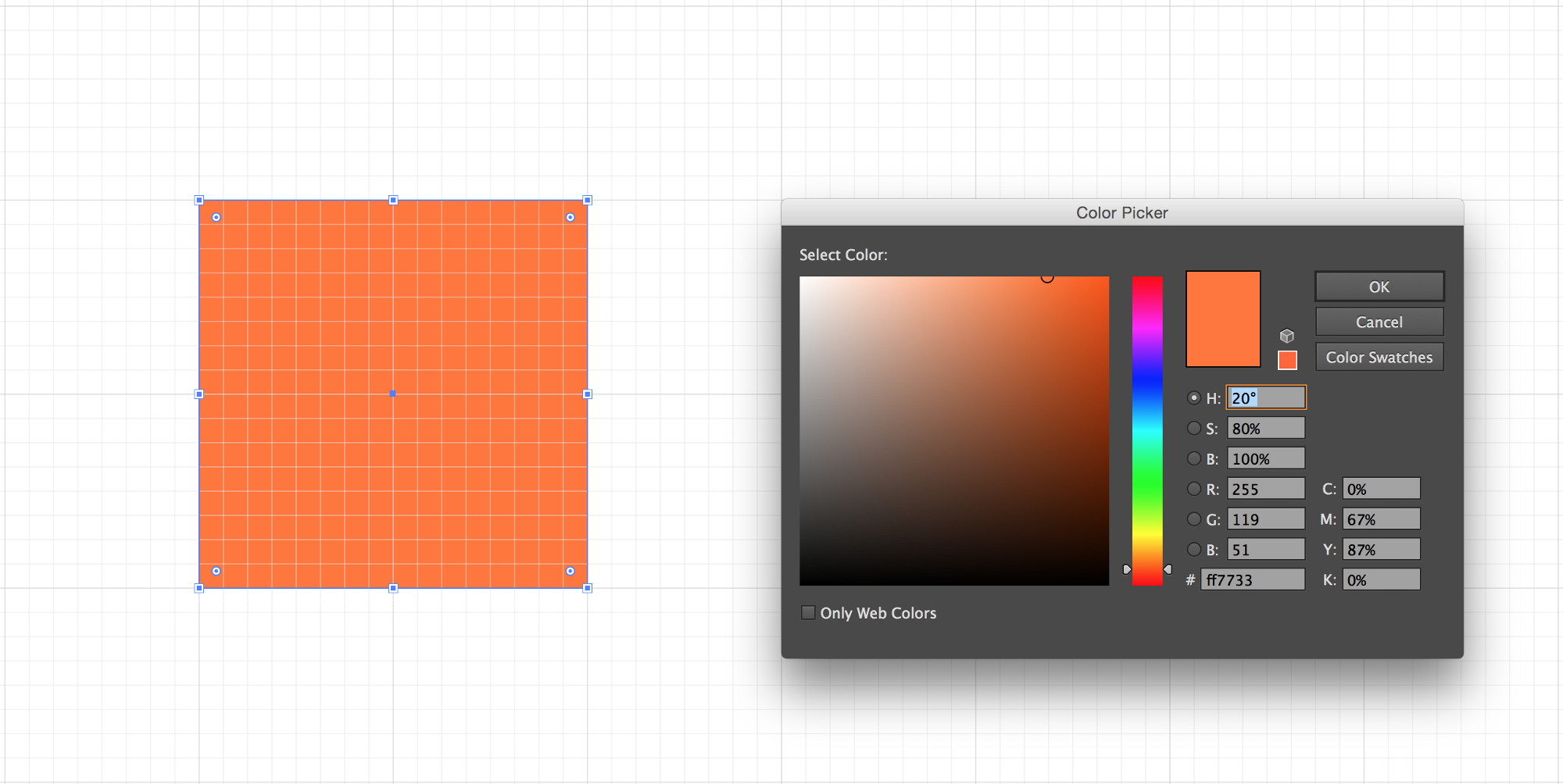
We can create an orange to accent it by bringing the hue down to 20°. HSB(20,80,100)
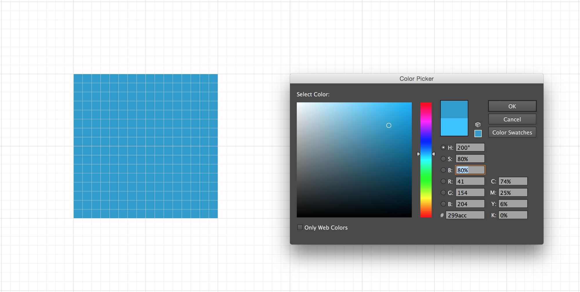
And now for a darker blue, dropping the brightness to 80%. HSB(200,80,80)
Workflow
When starting a logo, I always begin with black and white. This will allow me to focus on the content and spatial relationships over details. Otherwise, it’s kind of like when you would burn time picking just the right font for your middle school assignments.
However, I disagree with the notion of blindly wireframing interfaces without color. Color is hugely important in discerning UI elements and establishing contrast, so I always select my colors beforehand and tweak them as I go. And now a few quick tips.
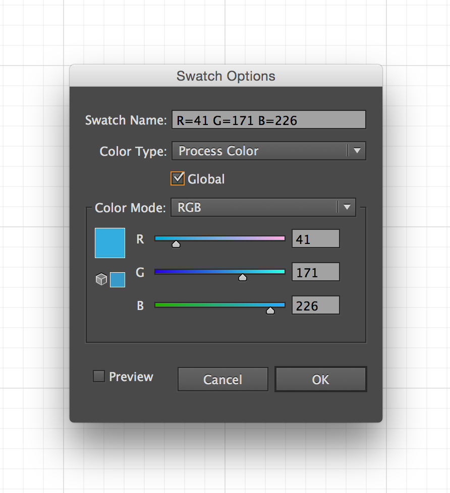
- Use global colors as much as you can. This operates similarly to text styles, where altering it later will automatically adjust every instance this color is used. In Illustrator, you can double-click on a swatch to bring up Swatch Options, then check Global.
-
Use palettes and libraries. This will help keep your colors consistent between documents. More on that here: 10 Essential Tips for Working With Color Swatches in Illustrator
-
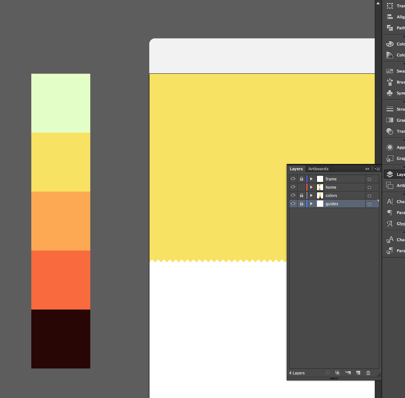
Keep some rectangle swatches on the side of the artboard for quick reference. I use these in tandem with the eyedropper tool all the time. You can throw these boxes in a separate, locked layer for unobtrusive access.
- Illustrator’s Color Guide window can be helpful, though I rarely use it.
Resources
- COLOURlovers: COLOURlovers is a creative community where people from around the world create and share colors, palettes and patterns…
- Adobe Color: Create color schemes with the color wheel or browse thousands of color combinations from the Color community.